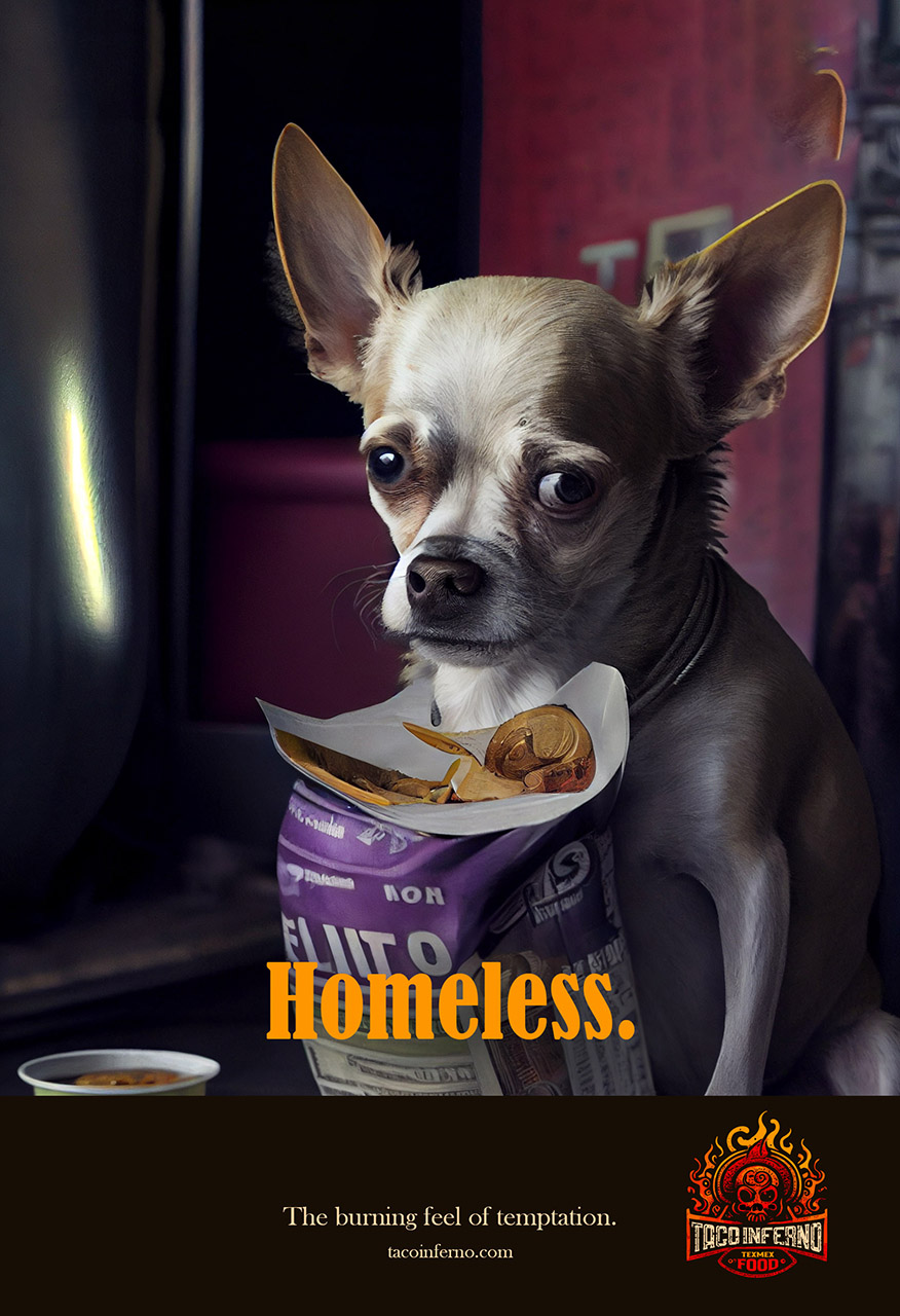
Taco Inferno is on a mission to be the hottest Tex-Mex food in town. Their branding, from the name to the advertising, has been carefully crafted to stand out in a crowded marketplace. As the creative director behind the brand, my goal was to create a unique and memorable image that would attract customers and make them crave our fiery and spicy flavors.
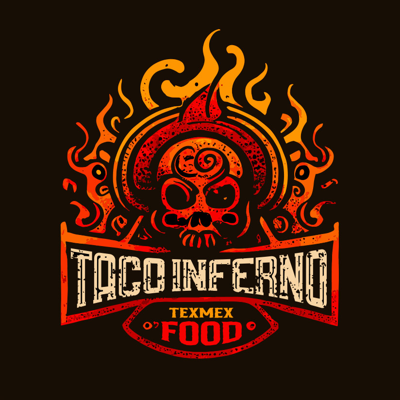
The name 'Taco Inferno' was chosen for its bold and provocative connotations, and we worked to incorporate elements of fire and heat into the branding. Our logo features a stylized flame, and our marketing materials often include images of hot chili peppers and calaveras (skulls), reflecting the spicy and edgy nature of our food..
Naming, Branding & Creative direction
In addition to the visual branding, I also focused on creating a strong and consistent brand voice that would appeal to the target audience. I wanted to be playful and fun, while also exuding a sense of sophistication and quality.
Overall, my goal with Taco Inferno was to create a brand that was not only delicious and satisfying, but also memorable and engaging. I believe that we've succeeded in achieving this, and I'm excited to see how their brand continues to grow and evolve in the future.
Client:
Taco Inferno - Texmex Food
Industry:
Fast Food
Product:
2002 Women's Hockey World Cup
Media:
Marketing mix
Date:
March 5, 2012


